OBJECTIVE
Redesign the landing page using insights from a site audit to transition from a gallery-style layout to a more functional e-commerce experience—merging the homepage and webshop to reduce friction and shorten the path to basket.
My contribution
Following my initial site audit, I partnered with the E-commerce Manager to overhaul the platform. I translated my research insights into foundational wireframes and worked in tandem with the design team during the high-fidelity mock-up phase, serving as both a designer and a UX consultant.
To ensure a seamless transition from design to production, I developed high-fidelity prototypes that served as the definitive guide for developers. By leading the prototyping process, I advocated for the user’s needs and ensured that my research findings were translated into functional, polished design solutions.
IMPACT
The post-launch data showed significant improvements in both user engagement and business performance. By streamlining the navigation and reducing friction in the "click-to-basket" journey, we achieved:
33% Increase in Weekly Orders: Direct evidence of a more efficient and less "punishing" user flow.
46.7% Boost in Conversion Rate: A clear indicator that the new design successfully turned site visitors into customers by aligning with their mental models.
My role
Research
Design
Prototyping
My team
Myself - UX designer
Holly - Designer
Marione - E-Comm Manager
the solution
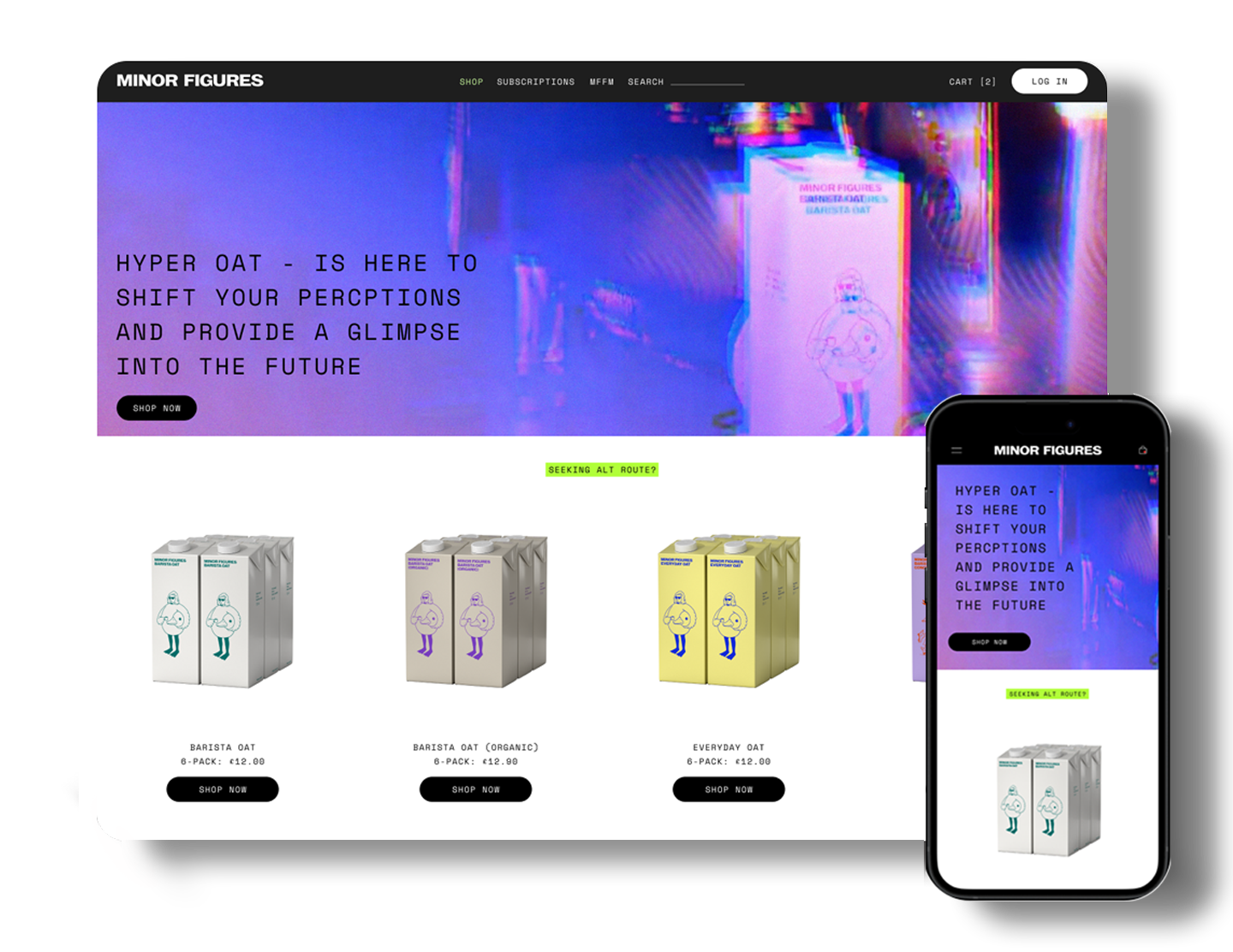
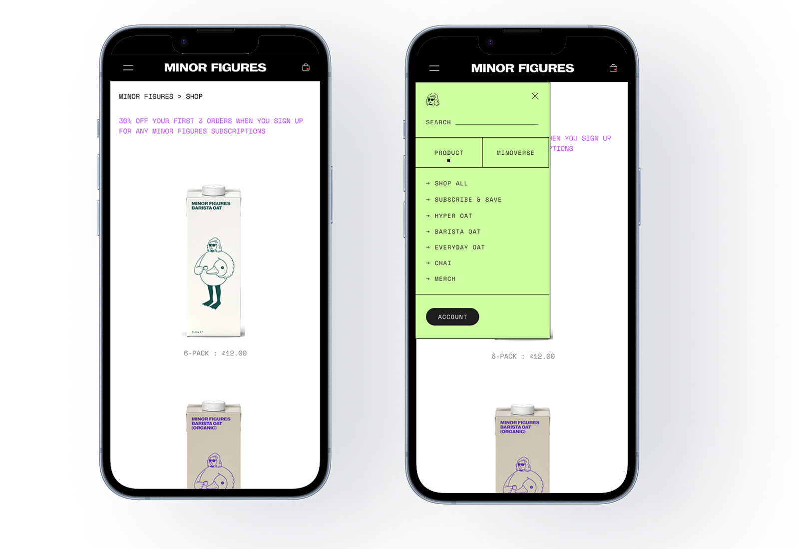
Since the audit, we observed a significant shift in traffic from mobile to desktop users—likely a result of usability issues in the previous design. To address this, we focused heavily on improving mobile navigation, as a solid mobile experience could easily scale to desktop.
We opted to replace the previous vertical tabs with a static top navigation. This included a drop-down menu on the left for all product categories and a basket icon on the right. The drop-down also features a secondary menu for additional content such as online games and the radio.
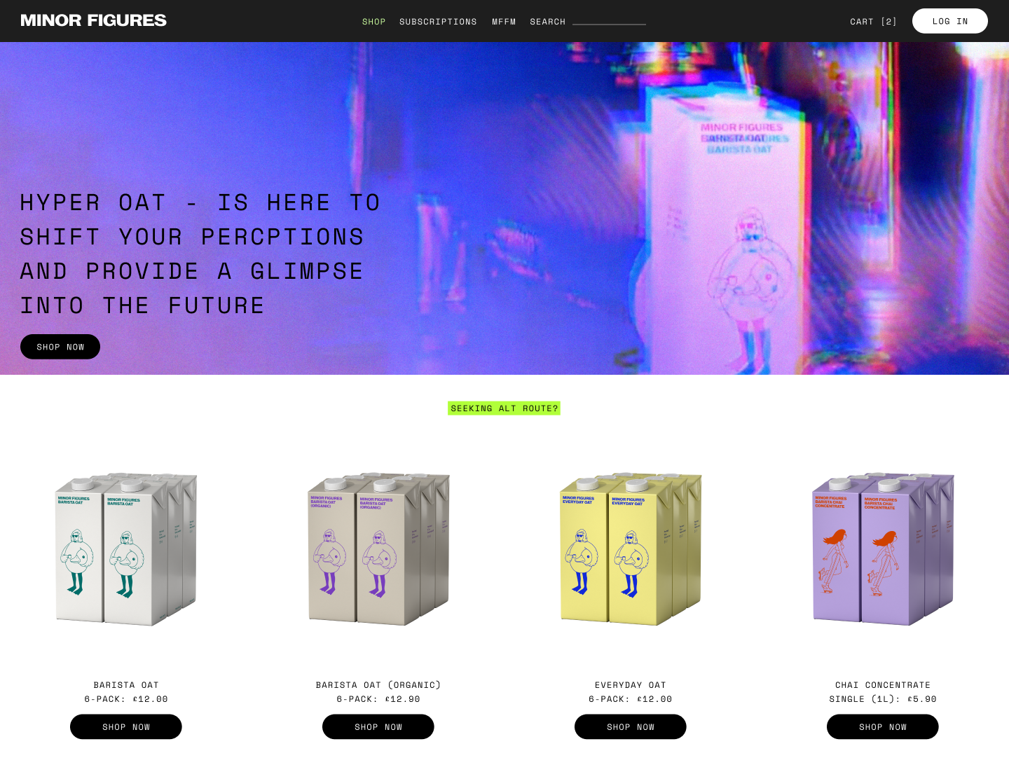
Additionally, we introduced a product gallery with call-to-action buttons beneath each item, making it easier for users to navigate directly to product pages and streamlining the path to conversion.

new features
*
new features *
Static navigation bar enhances usability and site navigation
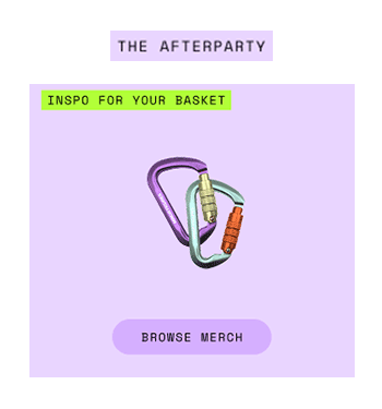
Streamlined additional content with space-saving side scroll
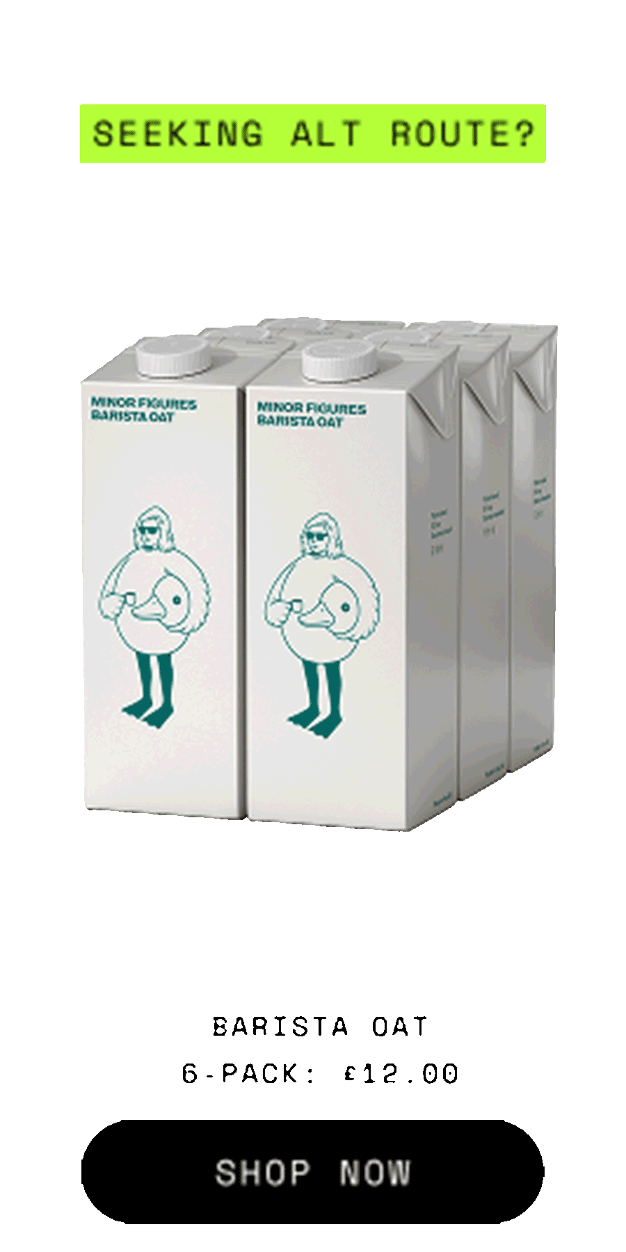
Simplified product carousel added to the landing page for quick product access
Optimising the Navigation Strategy
Our primary objective was to streamline the path to purchase by reducing the "click-to-basket" ratio and minimising friction points that led to user error. The previous iteration utilised vertical tabs, which, while unique, frequently clipped with product imagery and created a "punishing" experience where users struggled to recover from navigation mistakes.
OLD DESIGN
Balanced Familiarity
We transitioned to a persistent horizontal navigation bar, anchoring the site’s architecture with a clear hierarchy:
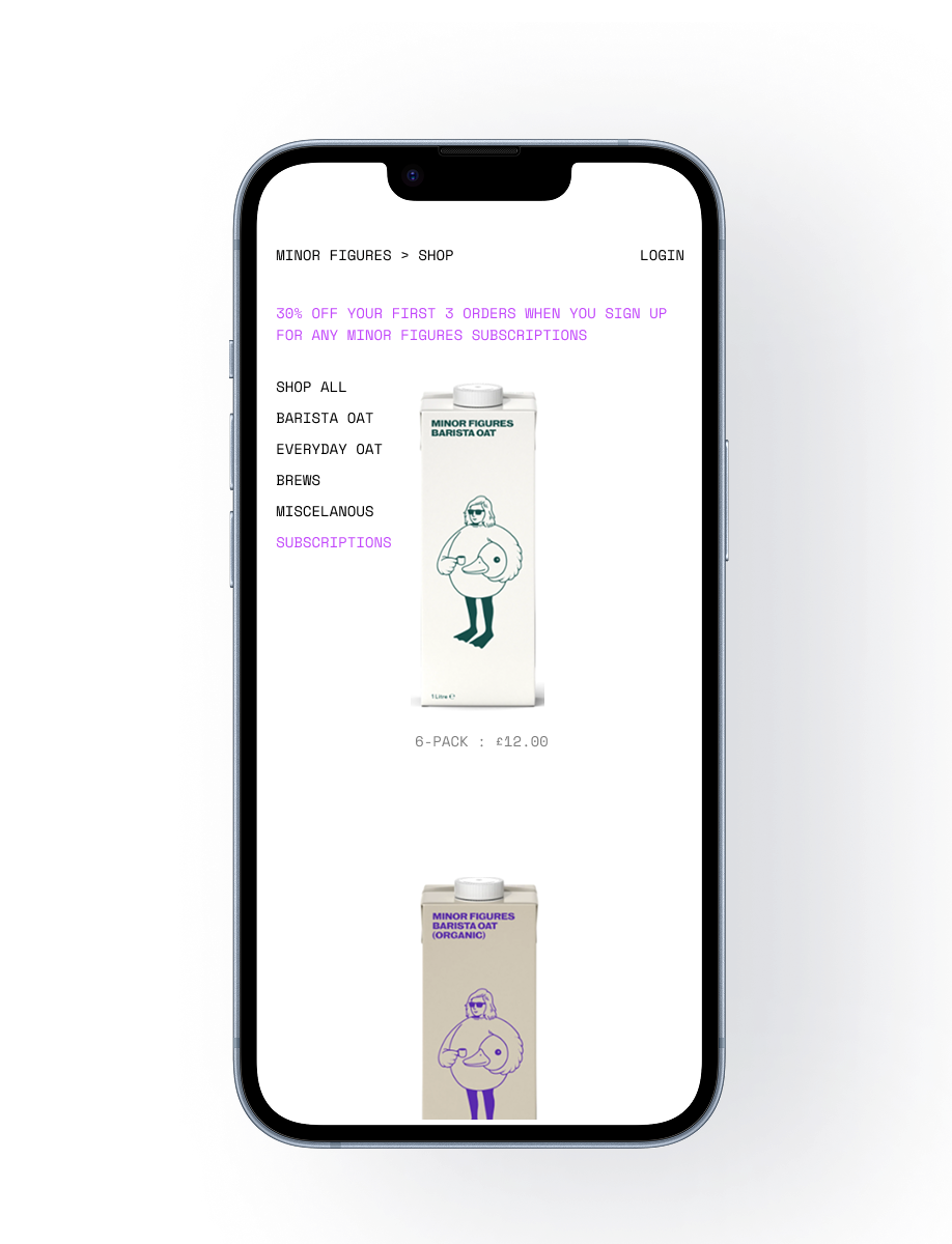
Primary Navigation (Left): A consolidated dropdown menu for intuitive product discovery.
Utility & Conversion (Right): A dedicated basket icon to keep the checkout path visible at all times.
Search Bar: With the growing list of products, a search has become necessary.
Account log: Account log-in moved to the drop-down menu for easier finding
RE-DESIGN
Design Rationale
By moving away from vertical tabs, we resolved the layout conflicts and aligned the interface with established e-commerce mental models. This shift ensured that the interface felt familiar to users, reducing cognitive load while still preserving the "gallery aesthetic" that defines the brand's visual identity.
Landing Page Consolidation
To further streamline the path to purchase, I led a redesign of the landing page, transforming it from a general information hub into a conversion-focused e-commerce storefront. Key enhancements included:
Optimised Product Discovery: Introduced a core range gallery featuring mobile-friendly side-scrolling, reducing the journey to a single click to reach the product page.
Targeted Messaging: Integrated a dedicated promotional banner to highlight new arrivals and seasonal campaigns, providing immediate value to returning users.
Universal Utility: Extended the global navigation bar to the homepage, resolving a critical flaw in the previous design where users lacked access to the basket from the landing screen.
Lessons Learned
Data-Driven Advocacy: This project reinforced how powerful site audits are when paired with performance metrics. By identifying the "punishing" nature of the old vertical tabs, I advocated for a navigation overhaul that directly led to a 46.7% increase in conversions.
Mobile-First Scaling: Starting with mobile navigation wasn't just a design choice; it was a strategic necessity. Solving for the smallest screen first ensured that the "click-to-basket" journey remained frictionless as we scaled the experience up to desktop.
Balancing Brand & Utility: I learned that "unique" UI elements (like vertical tabs) should never come at the cost of user mental models. We successfully maintained the brand’s "gallery aesthetic" not through layout gimmicks, but through high-quality imagery and a clean, persistent navigation structure.
Final Conclusion & Next Steps
The overhaul successfully evolved the platform from a "gallery" into a conversion-focused engine, resulting in a 46.7% conversion boost. The next phase focuses on transitioning from transactional success to long-term customer retention.
Revamping the Subscription Model
While the new navigation helped users find products, the current subscription flow remains a secondary feature. My next step is to redesign the "Subscribe & Save" experience to make it a primary value proposition: