Minor Figures
E-commerce Audit and Heuristic evaluation
Objective
This project focused on analysing the user journey to spot pain points and uncover opportunities to improve conversions beyond discounts. My recommendations include quick wins, long-term design goals, and updates to align the interface with industry standards.
The challenge
At Minor Figures, there’s a strong culture of boldness and creativity—a drive to be daring and different that fuels innovative design. However, this focus on visual expression can sometimes come at the expense of usability and functionality.
My challenge was to identify overlooked areas in the user experience and propose solutions that enhance usability while staying true to the brand’s distinctive, unconventional design philosophy.
Tools
Figma
Shopify Analytics
Microsoft Clarity
My role
Research
Design
Prototyping
the solution
Drawing from my findings, I proposed a light redesign of the e-commerce store and landing page to make navigation more intuitive without compromising the brand’s distinctive, gallery-inspired feel.
This included small usability improvements, such as adding a cart icon to the homepage, alongside larger design updates, such as a floating bottom navigation bar for smoother browsing.
research
Shopify Analytics
To identify problem areas, I began by analysing Shopify analytics. This provided key insights into user behaviour and performance metrics:
60% of users accessed the site via mobile devices.
The average conversion rate was 1.5%, peaking at 5% during promotions.
Only 50% of users completed a purchase after adding items to their basket
Heuristic Evaluation
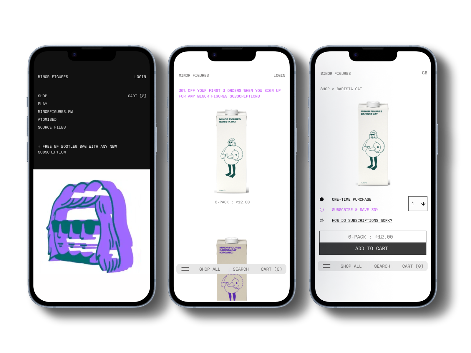
Next, I conducted a heuristic evaluation of the mobile user journey to identify pain points that deviated from UX best practices. Key findings included:
Basket icon visibility: Only appeared after items were added, unclear if you added an item by misclick.
No search function
Confusing navigation: Category tabs overlapped with product images and were difficult to tap.
The merchandise tab labelled "Miscellaneous" could confuse users.
These insights set the foundation for the next steps in refining the user experience
Microsoft Clarity
Given limited resources, I utilised Microsoft Clarity live session replays and heatmaps to validate findings from my Heuristic evaluation and uncover additional issues. Key observations included:
Frequent accidental navigation back to the homepage, causing drop-offs.
Heat maps showed only 30% of users scrolled past the first 20% of the site.
Mis-clicks on category tabs were common, leading to frustration.
Many users added items to their baskets but abandoned them without completing checkout.
These behavioural patterns confirmed the need for a design overhaul to reduce friction and guide users through the purchasing process.
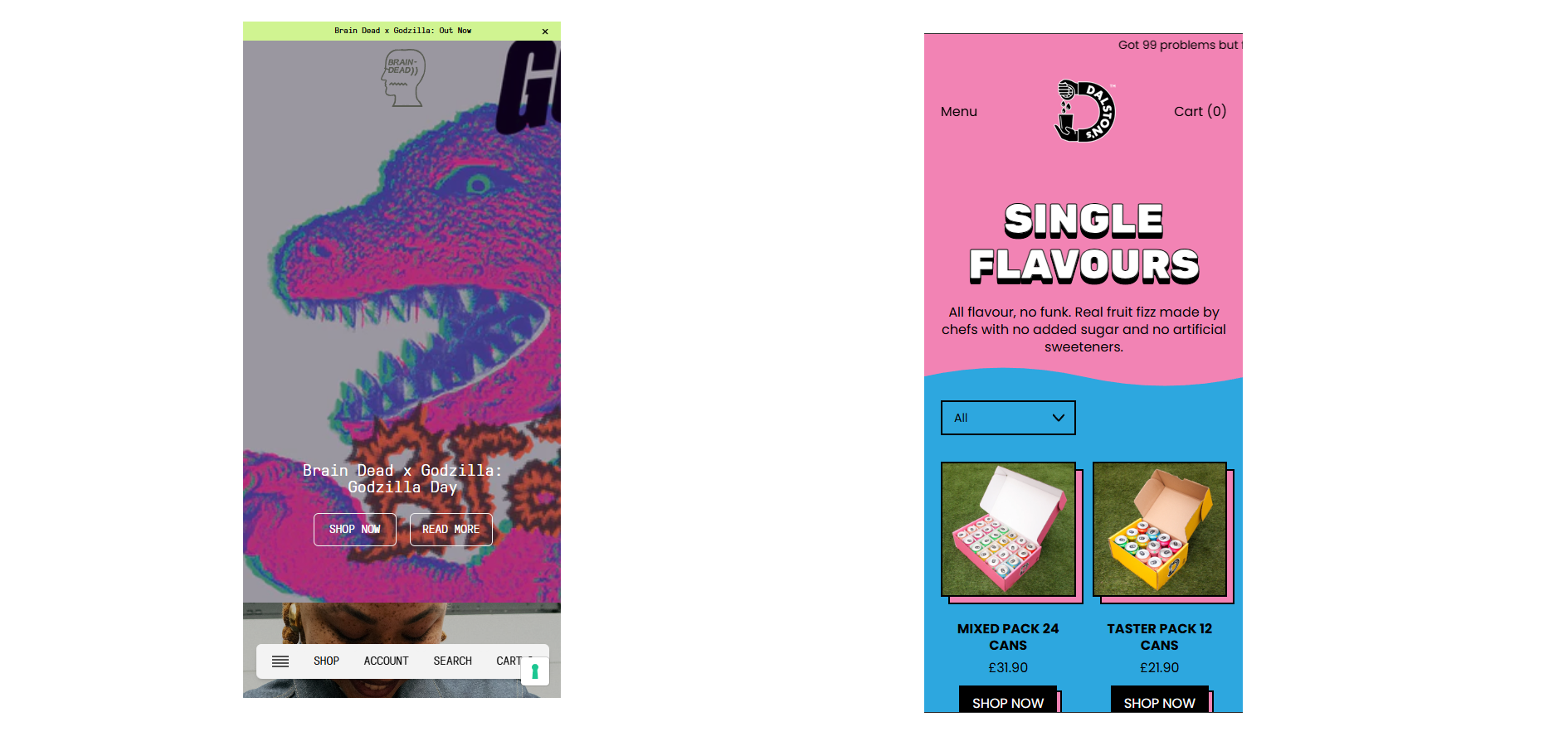
Competitor Analysis / Industry Leaders
To better understand effective navigation patterns in the FMCG sector, I examined several leading brands to see how they approached mobile navigation and product categorisation. At the team’s request, I also examined several unconventional fashion brands known for their bold design approaches.
Two standouts were Braindead and Dalston Sodas, both of which demonstrated seamless, intuitive site flow.
Common patterns observed among these industry leaders included:
Clear and accessible dropdown category menus
Horizontally scrolling sections for quick product exploration
A prominently visible cart icon throughout the browsing experience
These insights helped establish usability benchmarks and inspired solutions that balance creativity with functionality
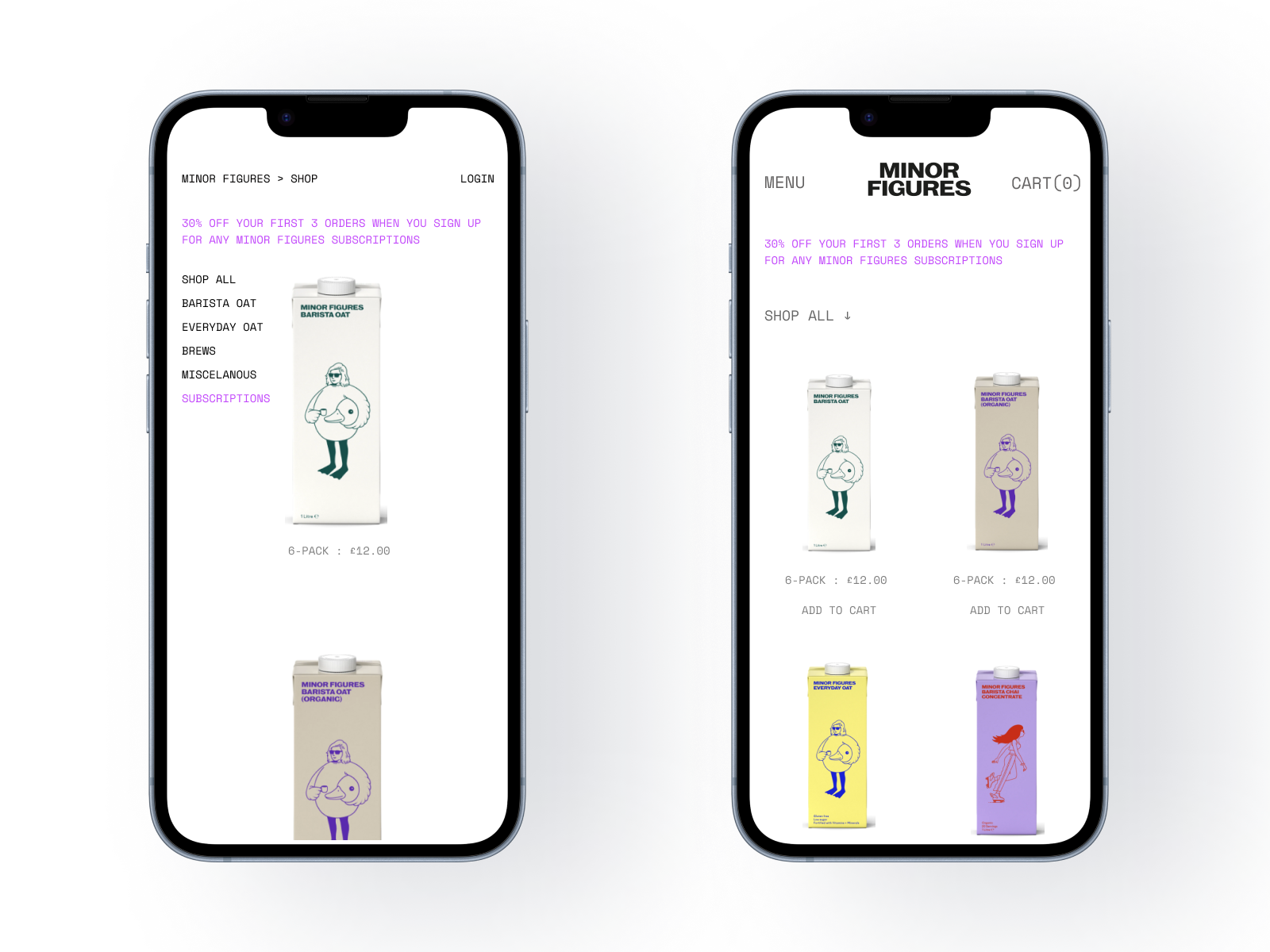
First Mock-up
Based on my findings, I created a revised mock-up to make the shop feel more like a functional online store and improve overall navigation. Key updates include:
Added a Menu element to the top left of the screen and increased text size for better readability.
Introduced a category drop-down menu to reduce clutter and simplify product selection.
Displayed two rows of products to minimise scrolling.
Added clear “Add to Cart” call-to-action buttons beneath each product.
ORIGINAL
MOCK UP
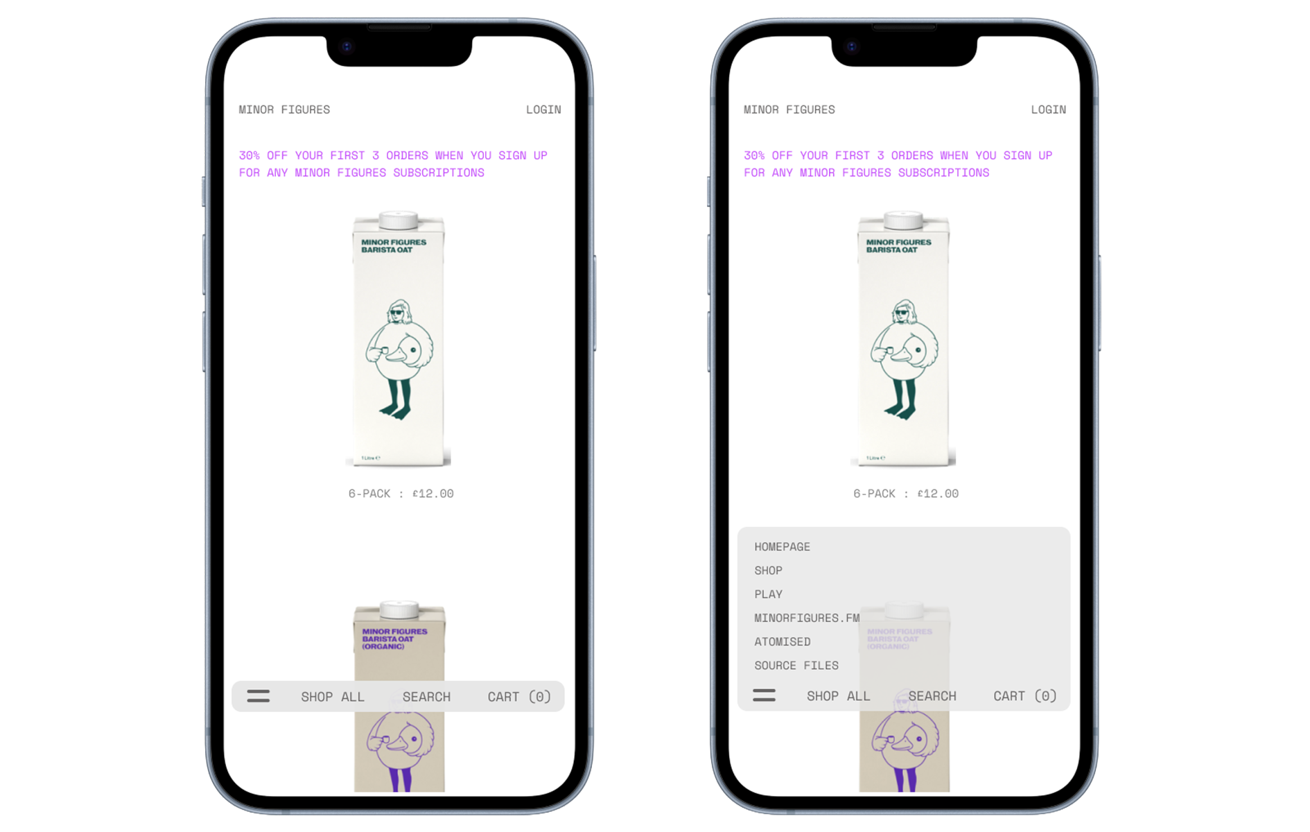
Floating Navigation
After receiving feedback from the team and seeing that my initial mock-up did not align with their design aesthetic, I introduced a simple floating bottom navigation bar.
This element complements the brand’s clean, gallery-inspired design while enabling users to move seamlessly between categories and explore the site with greater ease.
Learnings
This project provided valuable insights into collaborating with a client whose primary focus was on design aesthetics rather than user experience. I learned to navigate conversations with higher-ups and design teams effectively, demonstrating the tangible benefits of prioritising user-centric design principles to achieve business goals.
Next steps
In the short term, the focus will be on implementing small, high-impact improvements, such as adding a basket icon to the homepage, introducing clear “Add to Cart” call-to-action buttons, and refining category names to improve navigation.
In the long term, we plan to collaborate with a development team to assess the feasibility of implementing a floating navigation bar to further enhance the user experience.