The Objective
Reimagine the subscription journey as mobile-first, reduce churn, and simplify product selection for a growing catalogue.
The Challenge
Our subscription model generates 60% of our revenue, but the legacy interface was cumbersome, confusing, and resulted in high cancellation rates due to "order fatigue" (customers receiving excessive products).
IMPACT
+3.5% Increase in total subscription share (from 60% to 63.5%).
5% Reduction in cancellations/pauses by helping users select the correct volume at the start.
My team
Myself - UX designer
Holly - Designer
Marione - E-Comm Manager
My Role
UX Designer (Strategy, Wireframing, and High-Fidelity Prototyping)
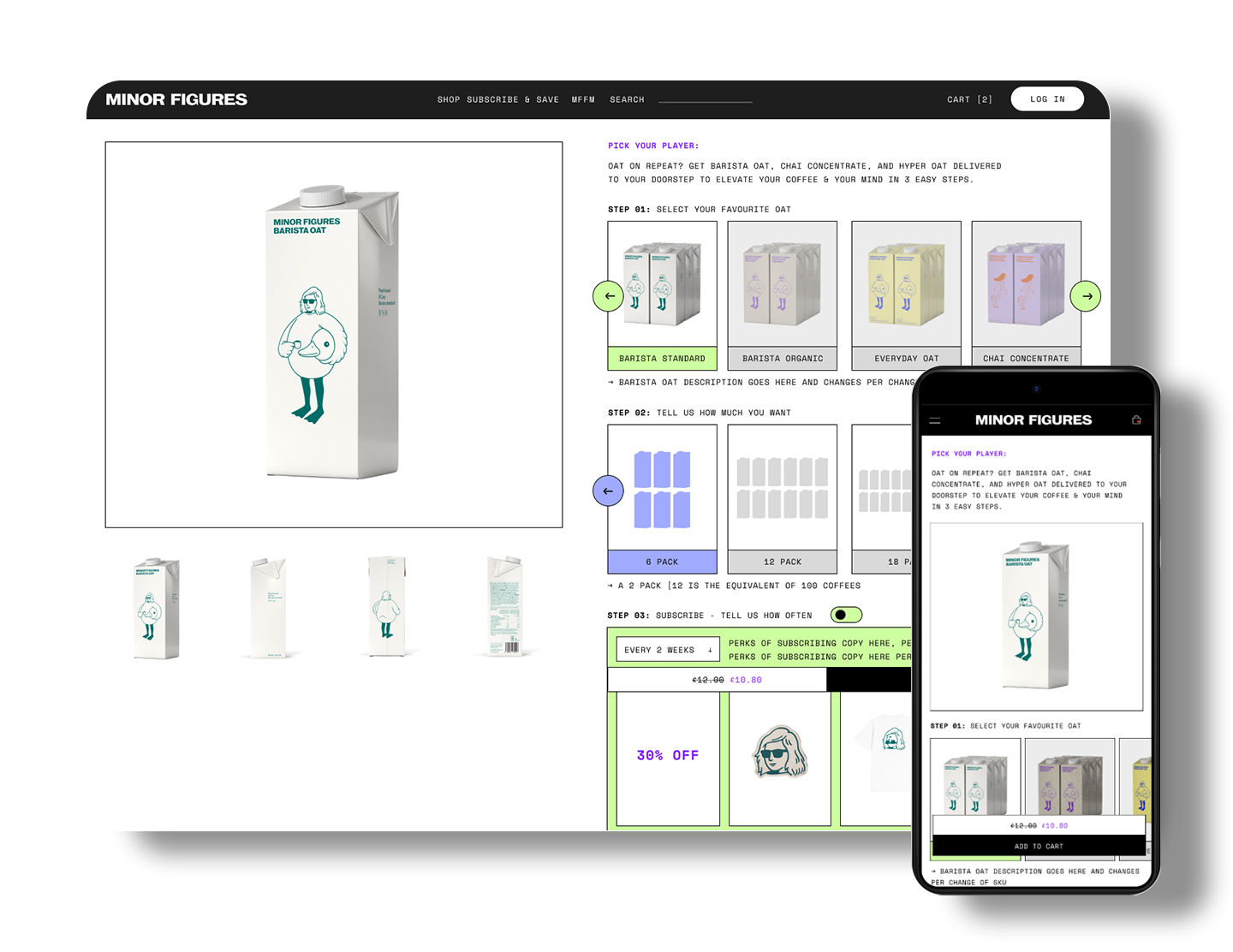
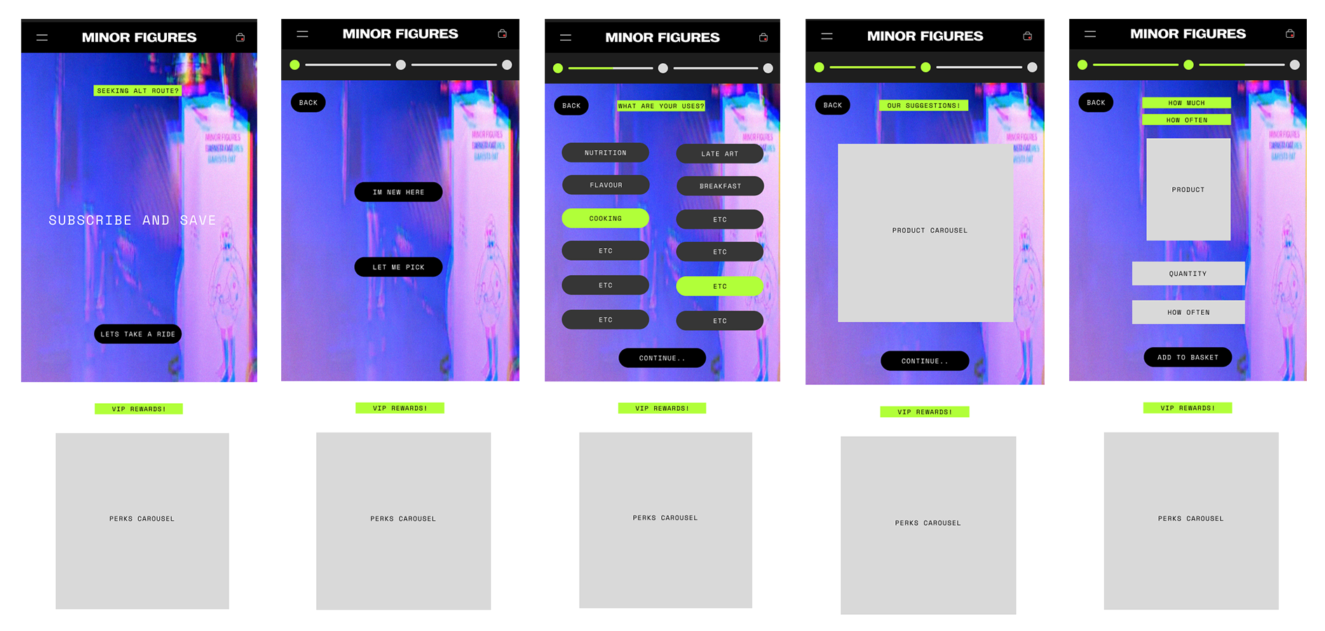
The Solution: A Frictionless "Subscription Hub"
To address user confusion and over-ordering, I transitioned the experience from a dense list to a guided, step-by-step, modular journey:
Mobile-First "Side-Scroll" UI: Implemented a horizontal product and volume selector to minimise vertical bloat.
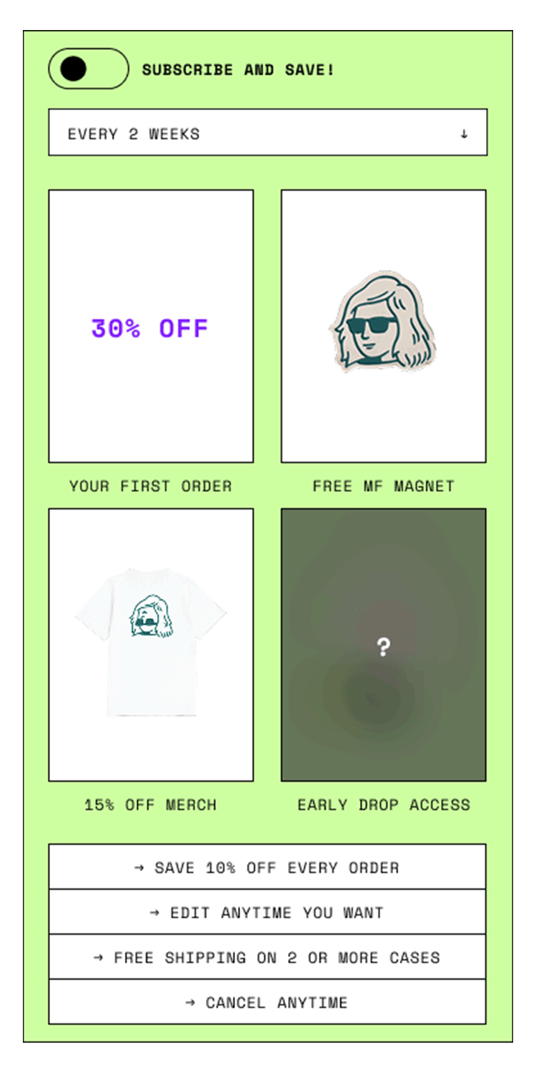
Value-Driven Toggles: A clear "Subscribe vs. One-Time" toggle that visually emphasises savings without "punishing" or trapping the user.
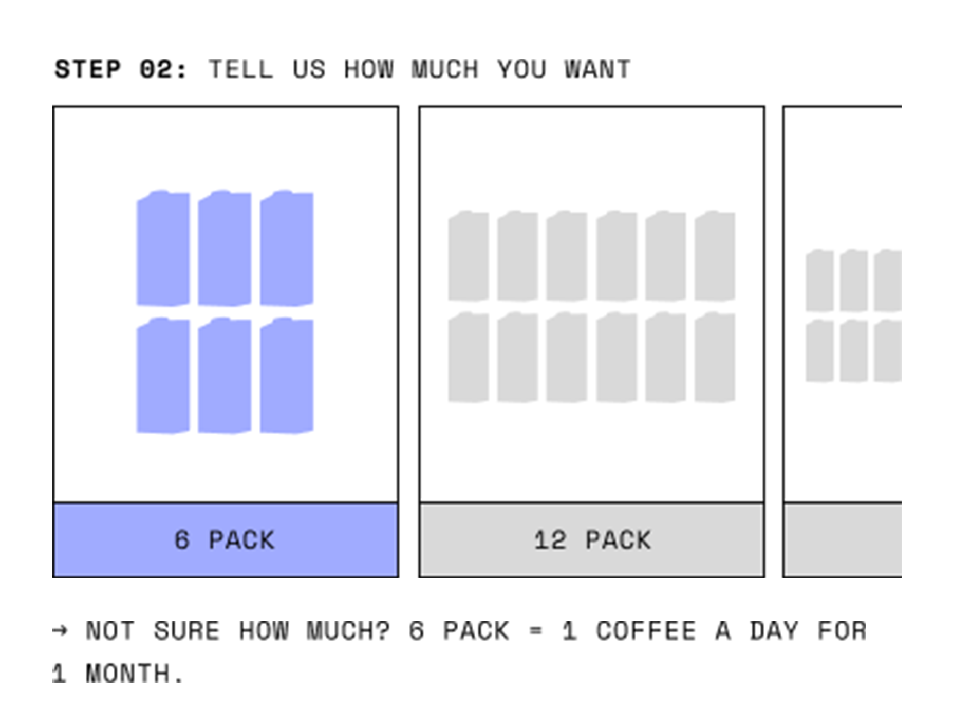
Contextual Guidance: Added "Best Used For" descriptions and volume calculators (e.g., "1 carton = 1 week of coffee") to help users right-size their orders.
Persistent CTA: A floating "Add to Basket" bar with real-time price updates for easy checkout on mobile.
Identifying the Friction
The original design focused heavily on explaining how a subscription works, which felt condescending to modern users. Through customer feedback, I identified two core pain points:
Product Paralysis: Users weren't sure which product suited their needs.
Over-Ordering: Users ordered too much, leading to a surplus at home and eventual cancellation.
long, condescending text blocks that didn’t translate well to mobile
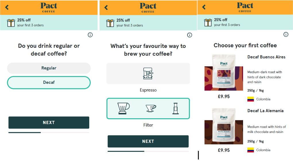
Competitive Benchmarking
With tight deadlines, I analysed industry leaders in the FMCG sector, such as HelloFresh and Pact Coffee. While we initially explored a quiz-based recommendation engine, we pivoted to a "Subscription Hub" layout to bring a high-quality solution to market faster.
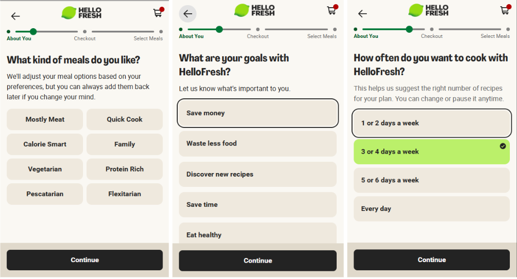
User questionnaire
Inspired by HelloFresh, I mocked up a questionnaire-based flow to help new users find their perfect product match. While shelved for the initial MVP to meet deadlines, it remains a high-priority iteration for our personalisation roadmap.
Design Decisions & Features
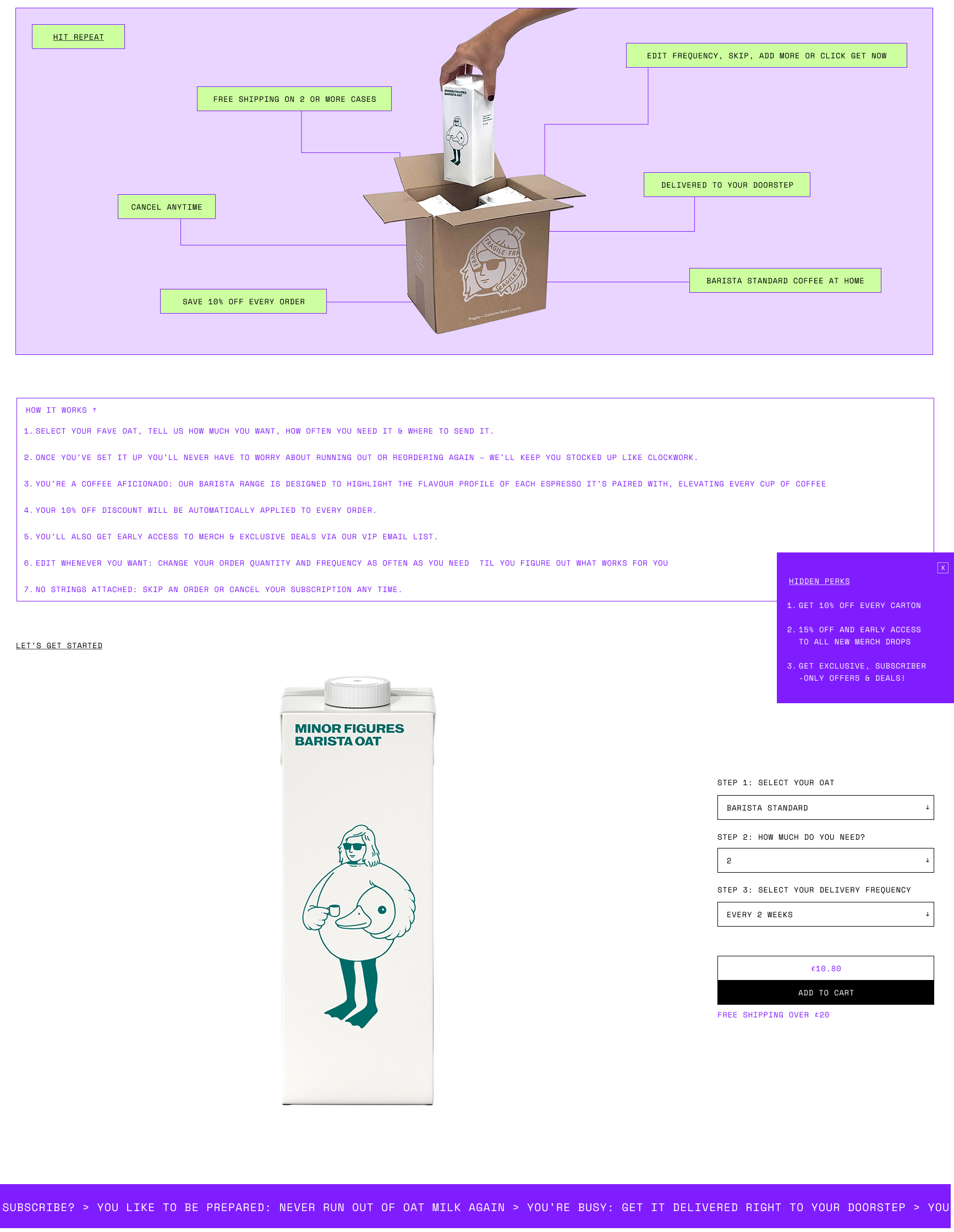
Helping Users "Right-Size": Instead of just listing volumes, we added visual aids and text explanations. For example, under the volume selector, we added the text "6 pack = 1 coffee a day.." This directly addressed the issue of customers ordering too much and then cancelling out of frustration.
The Benefits Toggle: To increase transparency, I designed a toggle for the "Subscription Bonus."
Subscribed Mode: Prices are highlighted, and bonuses are visible.
One-Time Mode: Prices revert to RRP, and bonus info is greyed out. This puts the power in the user's hands, building trust.
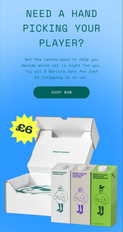
The "New User" Safety Net: Post-launch, we found that some new users were still hesitant to commit to a full case of a single flavour. I integrated a CTA for a "Mixed Core Taster Pack" at the bottom of the page, providing a lower-barrier entry point for the brand.
The Outcome
The redesign successfully balanced business goals with user needs. By focusing on clarity over "instruction," we saw immediate improvements in our core metrics:
Conversion: A 3.5% lift in subscription adoption (60% to 63.5%).
Retention: A 5% drop in cancellations, proving that helping users pick the right amount of product is better for long-term revenue than just selling them the most product.
Key Takeaways
1. Context is King users don't need a manual on "how subscriptions work"—they need to know how the product fits into their specific life. Translating "6 pack" into "One coffee a day for a month" was a small copy change that had a massive impact on user confidence.
2. Managing Scope vs. Ambition The "HelloFresh-style" questionnaire was a strong idea, but recognising the need to launch a functional "Subscription Hub" first taught me the value of MVP (Minimum Viable Product) thinking. It’s better to deliver a solid improvement today than a "perfect" solution three months too late.
3. Mobile-First is Non-Negotiable With the rise in mobile traffic, designing for the thumb (floating CTAs and side-scrolling) wasn't just a design choice—it was a business necessity. The ease of the "Subscription Hub" on mobile directly contributed to the lift in sign-ups.